Cisco Umbrella

Utilizing an approach of "raw" and "cooked" to combine the existing warehouse with more considered architectural insertions, Min Design created a series of social and working spaces for Cisco Umbrella.

  • Type Architecture, Interiors, Workplace
  • Location San Francisco, California
  • Area 56,000 sf
  • Status Completed
  • Date 2016

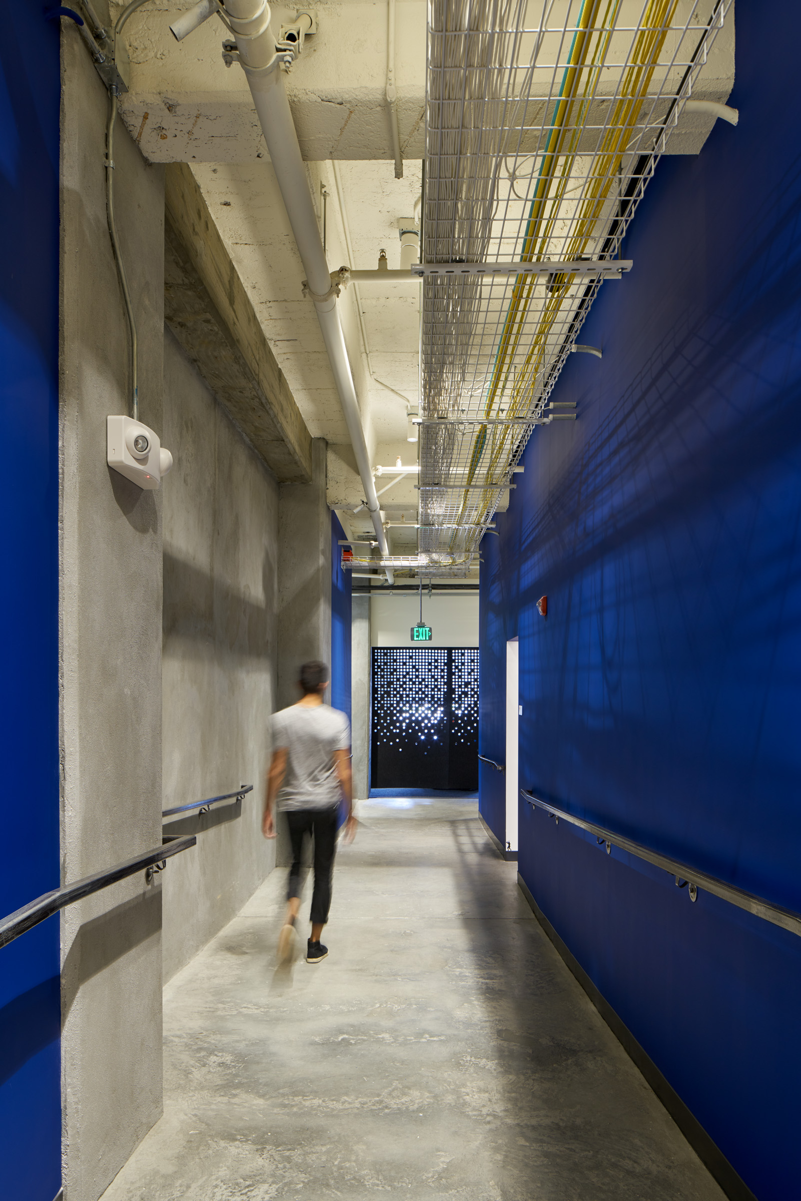
OpenDNS (now Cisco Umbrella)  a rapidly growing tech company, already occupied 14,000 sf in a SoMa warehouse when they acquired an additional 14,000 sf and engaged Min Design (formerly Min Day) to design the first of two expansions. The charge was to connect new and existing workspaces with minimal disturbance to operations. The design overcomes the egress and infrastructure requirements of new occupant loads in the 1915 building while maintaining the raw industrial character of the existing building. By minimizing painted gypsum board surfaces, consolidating them to core areas, and maintaining exposed concrete columns with mushroom capitals, concrete ceilings, and exposed ventilation and conduit, the project combines raw and cooked qualities of architectural finish. The newly designed elements incorporate company branding through use of color and graphics while blending formal and informal work areas.


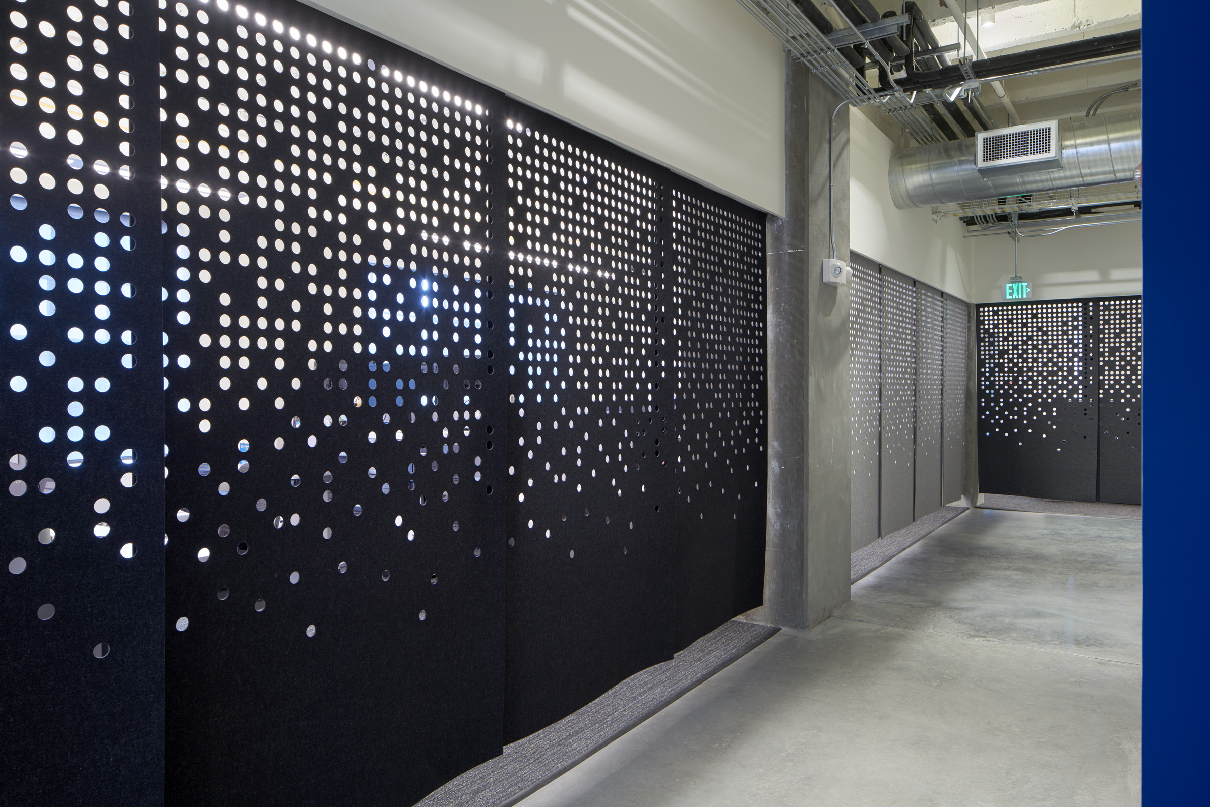
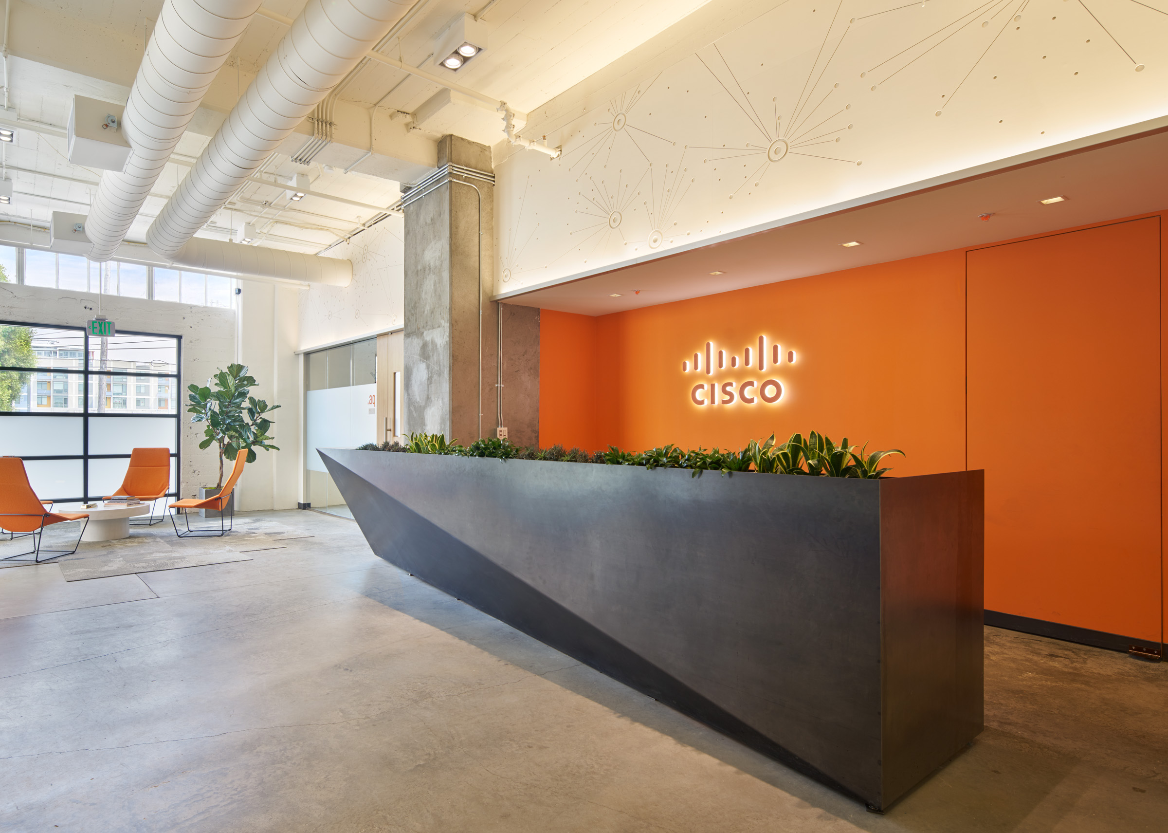
Entry lobby with custom 16-foot steel reception desk, panels above are milled with a data visualization produced by a company engineer.

Detail of reception desk with flip-top sign-in and succulent trough
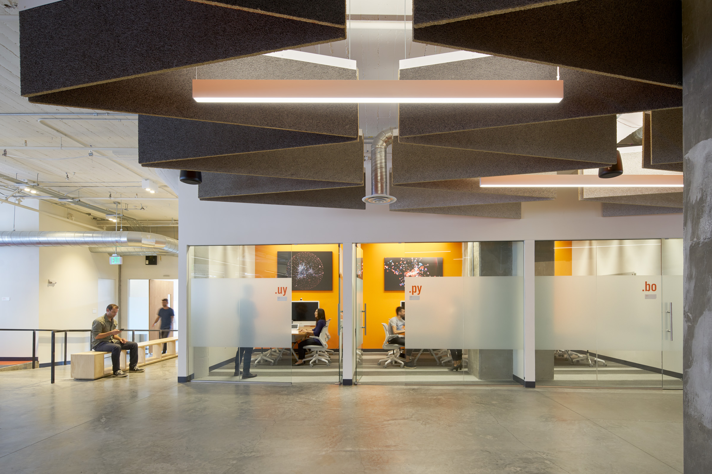
Conference rooms fronting the all-hands space, painted acoustical panels in the foreground.
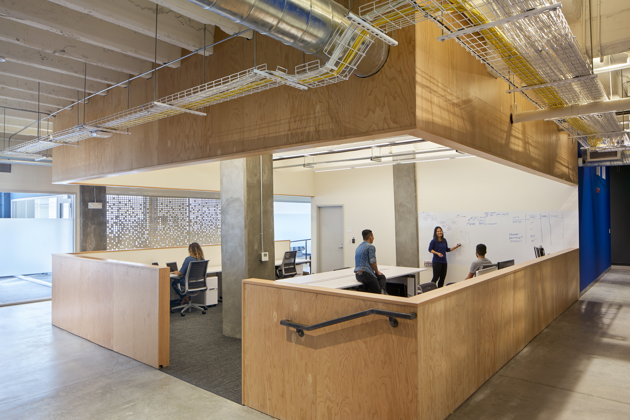
One of multiple engineering team areas, this area was designed to be open and approachable as the team interacts with all divisions across the company. Plywood was chosen for its informal qualities and to contrast with the exposed concrete and gypboard walls.
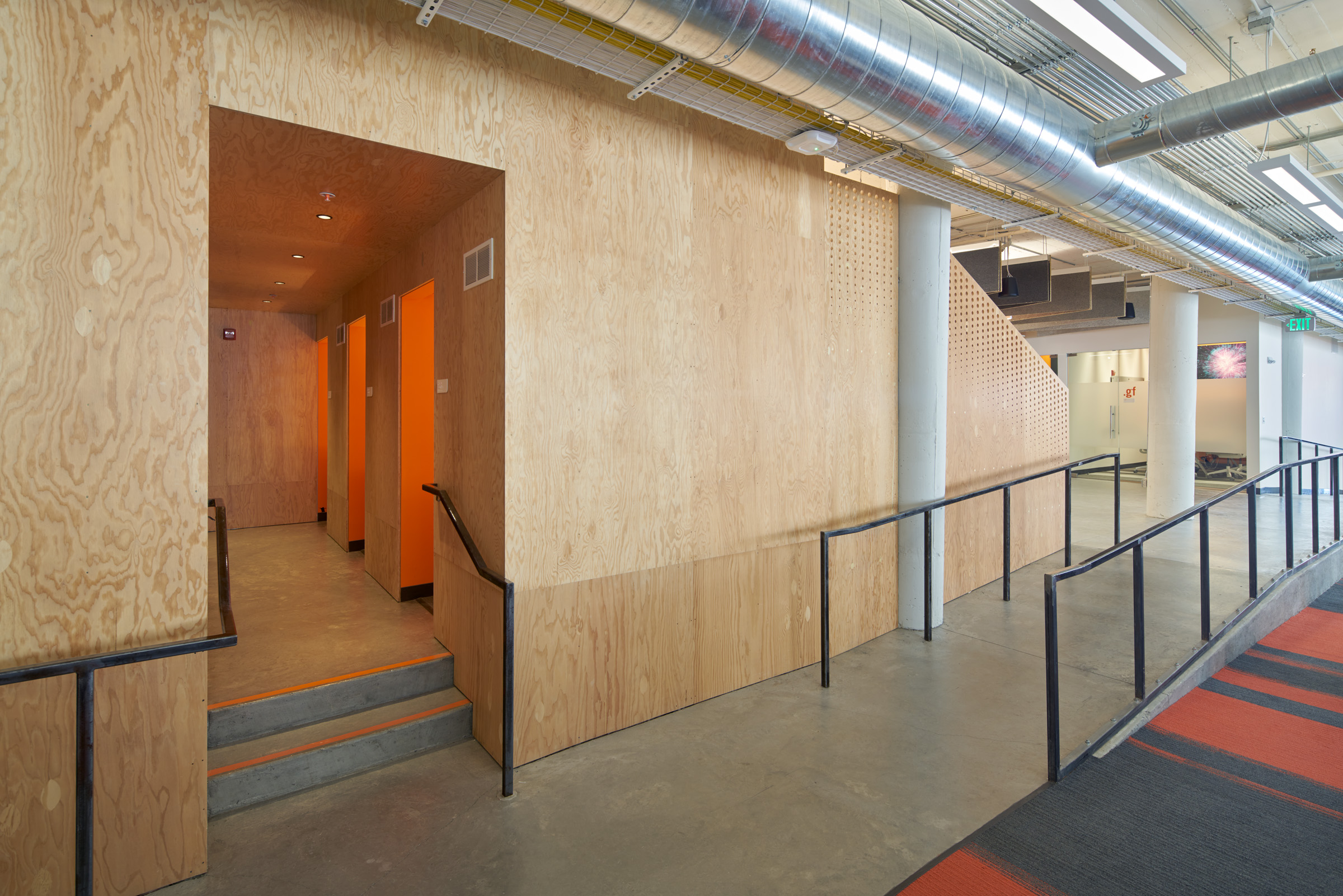
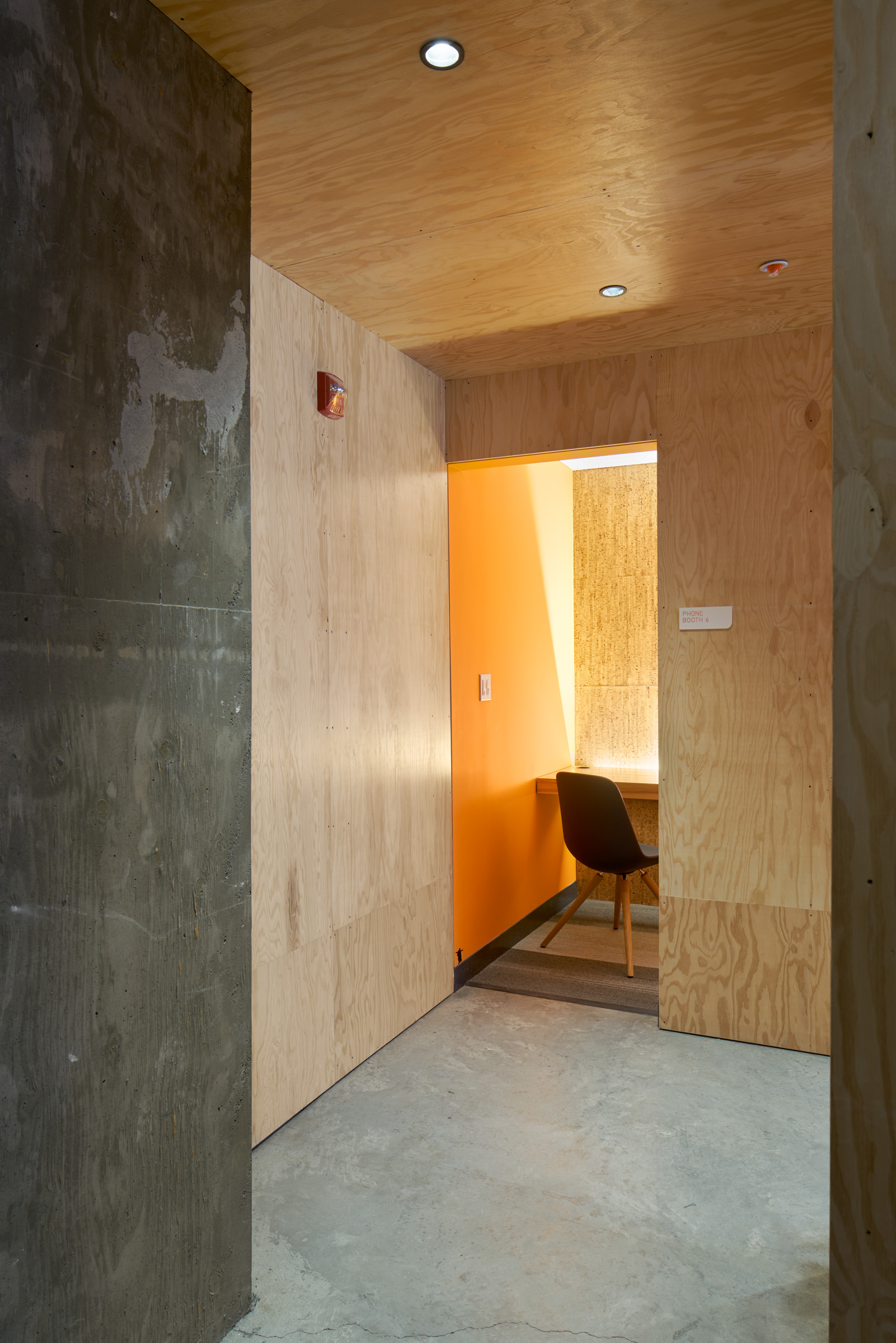
The most private spaces are hidden below the raised seating at the all-hands area.
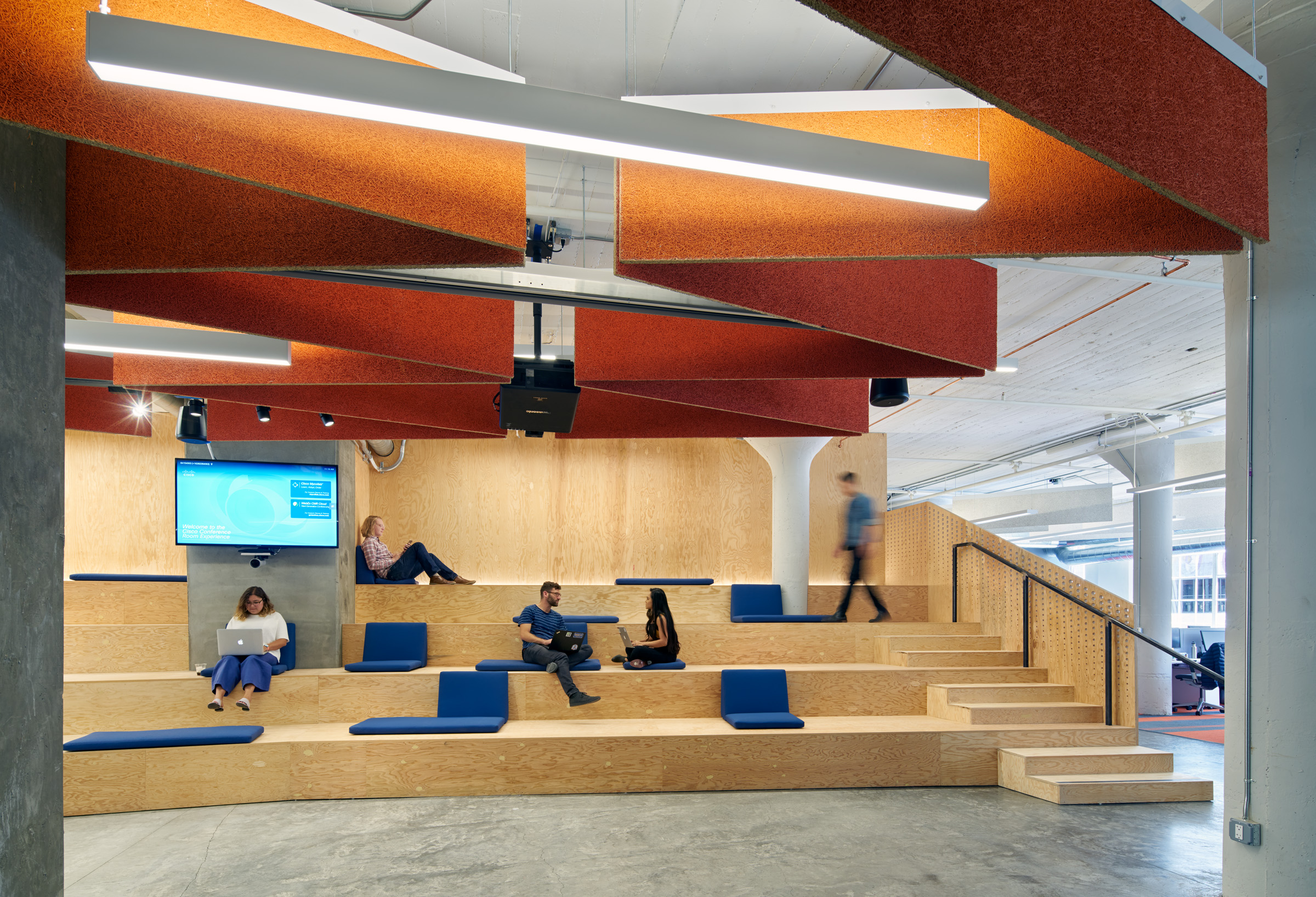
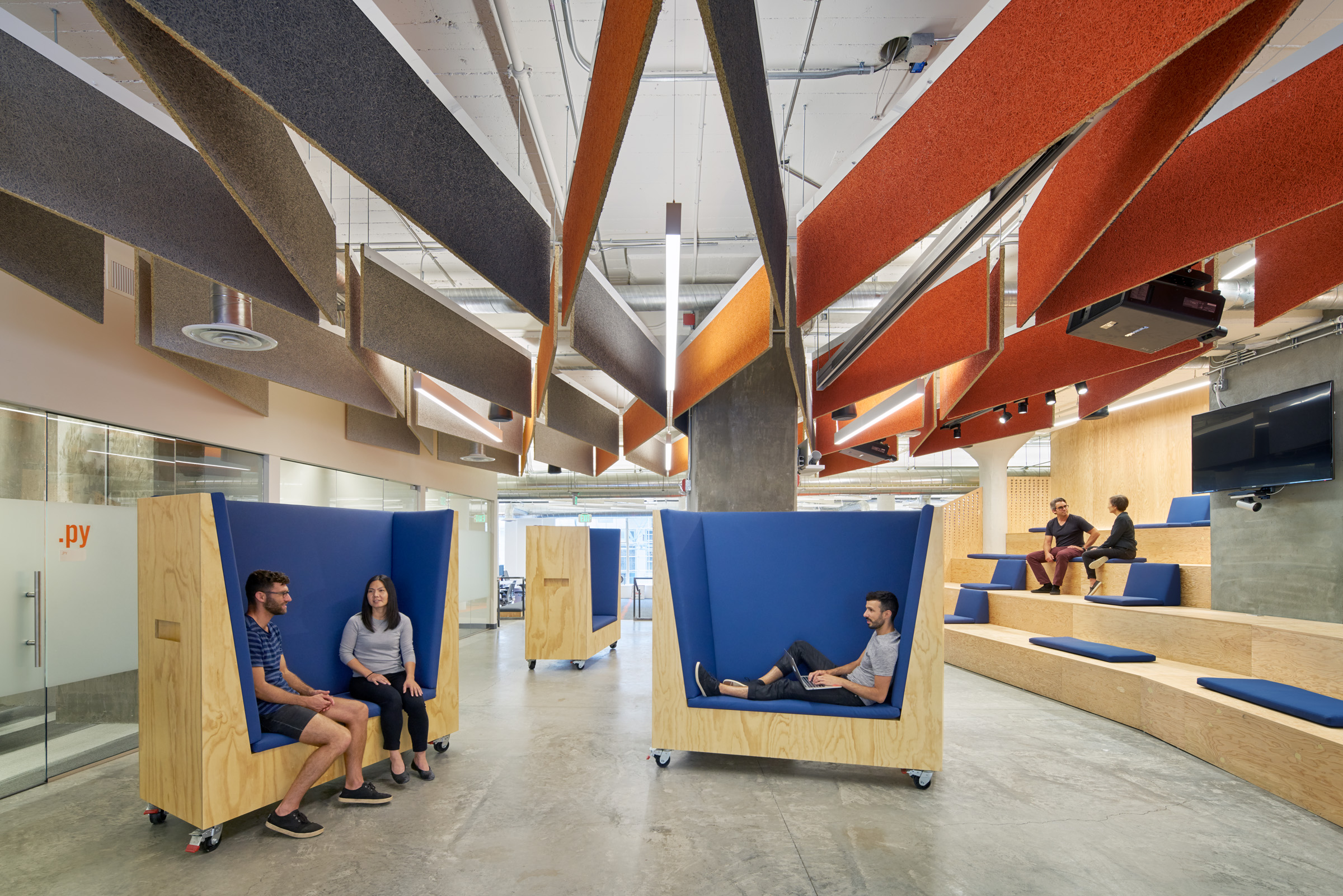
View of the all-hands with painted suspended acoustical panels.
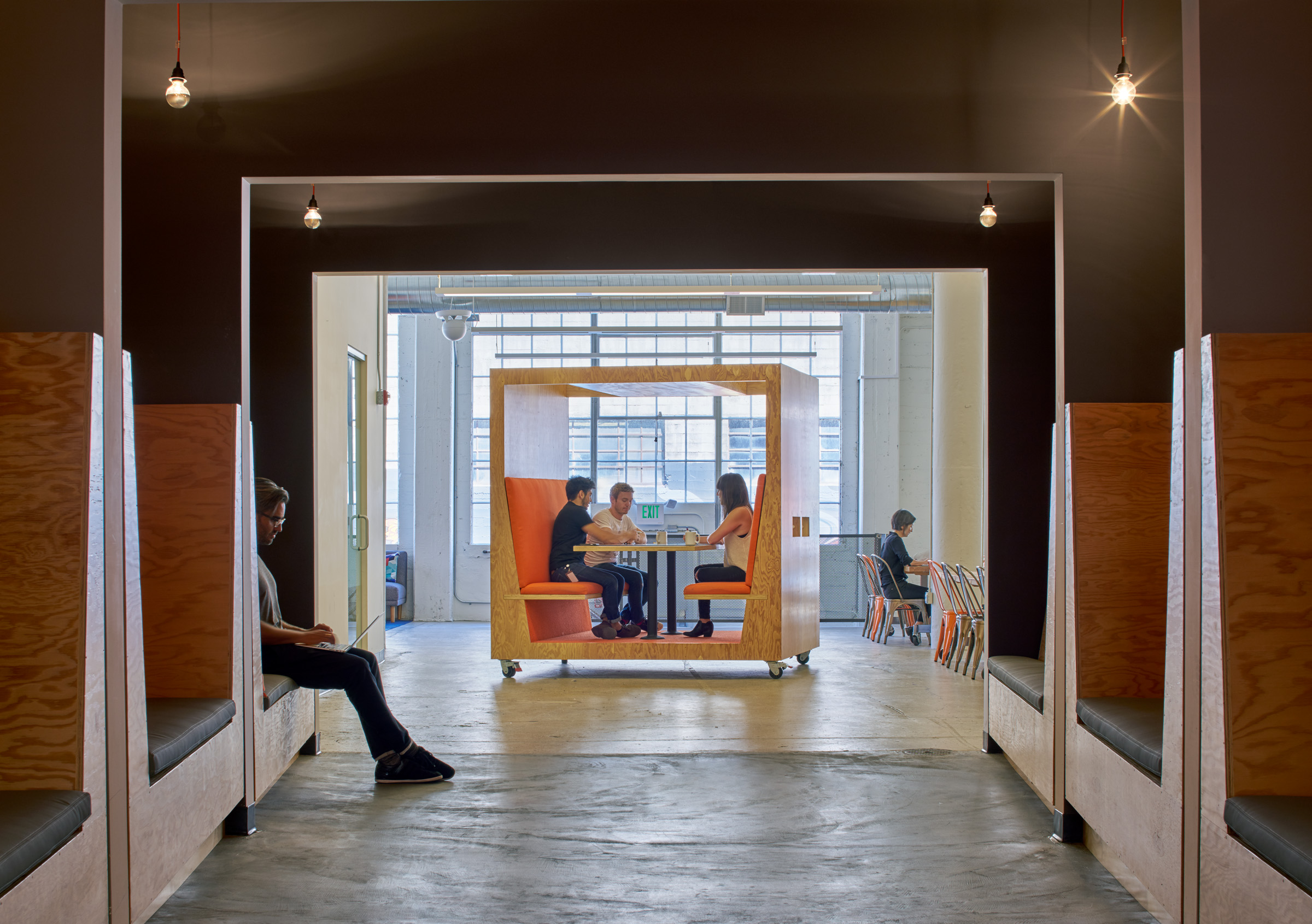
“The Portal” is a transition zone linking work areas to the cafeteria. Gradients of orange and grey describe each direction through the portal.

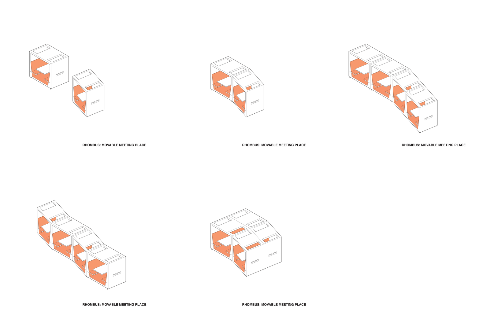
We designed custom mobile meeting units. By utilizing a rhombus, these can be joined / arranged in several configurations.
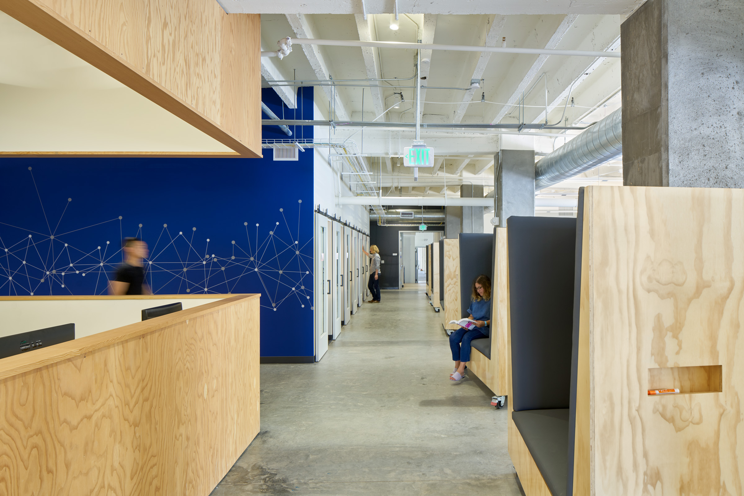
Additional custom furniture has been coated with clear IdeaPaint over the plywood. This allows for breakout seating and meeting areas.

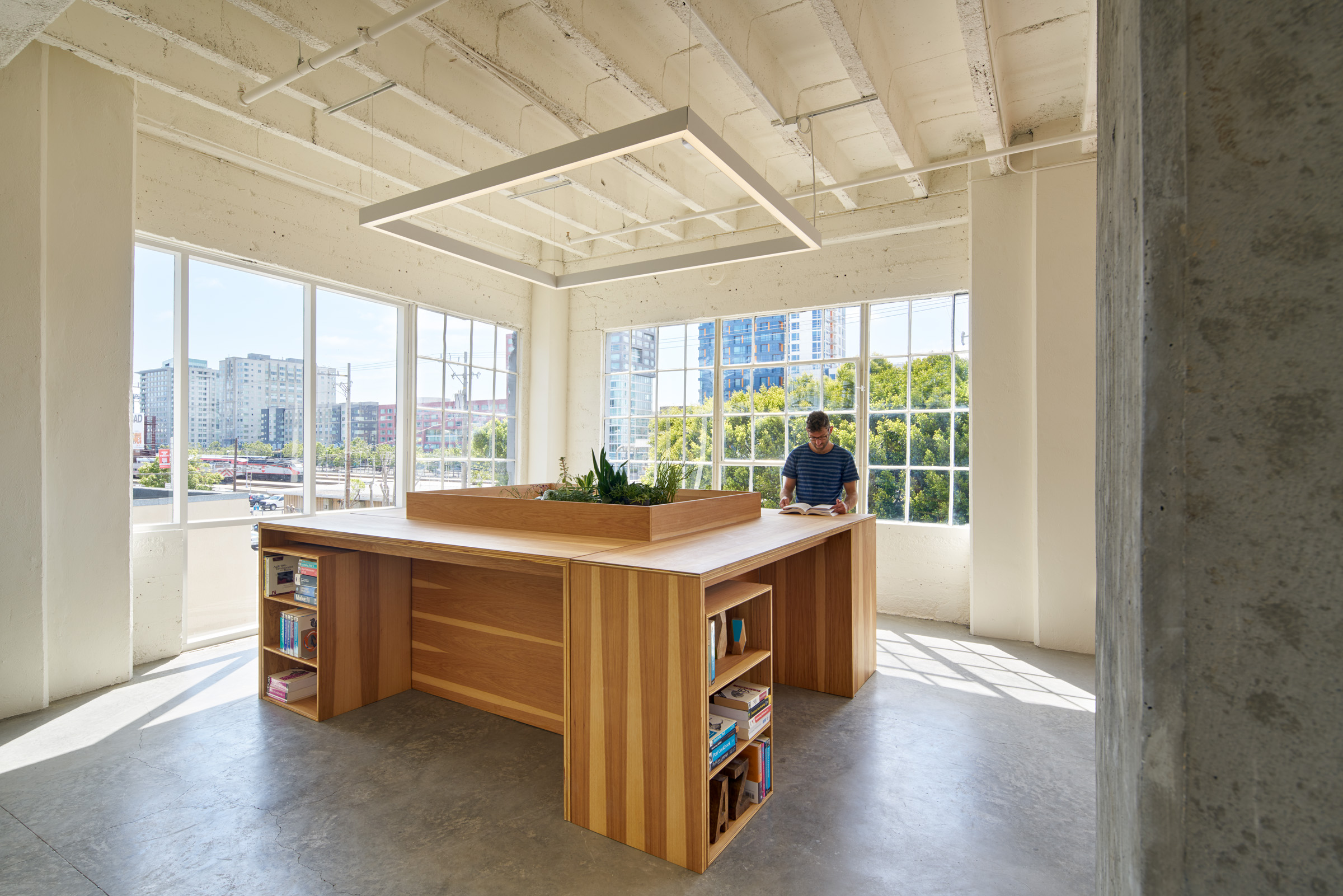
Four custom high tables can be arranged to create a standing reference and game library.
Photography By Photography by Bruce Damonte
Scroll to Top